
We are going to cover the following topic in the mobile checkout experience :
- Why checkout experience is important?
- Checkout Initiated in mobile
- Discuss Cart Page Experience
- Discuss Checkout page
- Order Confirmation Notification
Summary: Optimize the mobile checkout experience with the least action and requirement from the customer.
Why mobile checkout experience is important?
User Experience counts at every node, from online order booking to delivery of the product. If everything is fine, then only we gain the trust of the customer and review. Review gains the trust of another customer.
But here, we discuss the mobile user experience during the checkout process. In research, we find only 30% checkout is successful others 70% count as abandonment cart.
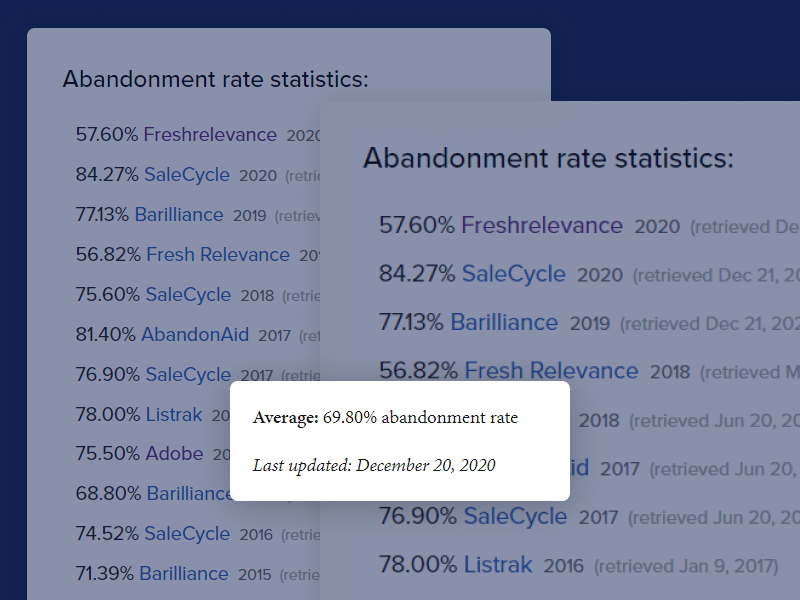
So we don’t have an option here and we should have a better user experience process for checkout to reduce cart abandonment, and then only we can increase our sales.
Checkout Initiated in mobile
We can initiate checkout from 2 pages
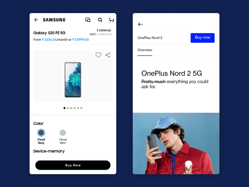
1. Checkout directly from product page
When a user buys a costly product or a single product, they usually click on Buy “Buy Now” and this button directly redirects the user to the checkout page.
2. Checkout from Cart Page
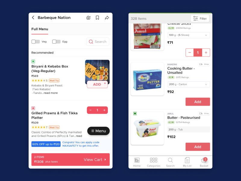
When a user wants to purchase numbers of products like grocery products, food items, or event items then use the “Add to Cart” button
It depends on the eCommerce store. If your store likes Amazon, Etsy, and eBay use both buttons.
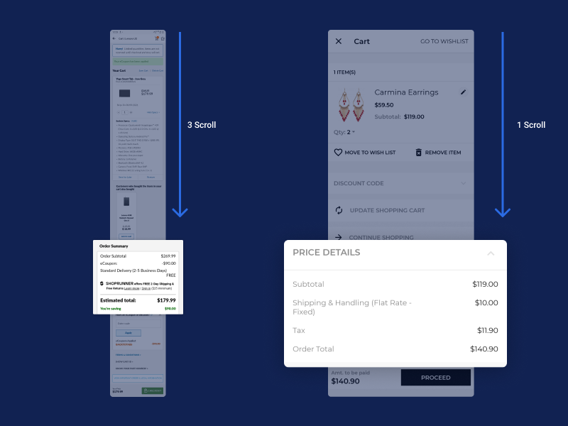
Cart Page Experience
Checklist for the cart page UI
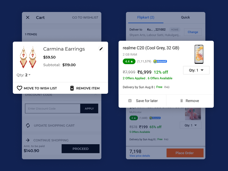
- Product photo, name, custom details, and product link
- Ability to remove, save for later, and change details like item quantity
- Order Summary : product prices, tax, shipping and any discounts
- Estimated date of delivery
- Calls to action (Checkout, Keep Shopping)
Cart Icon
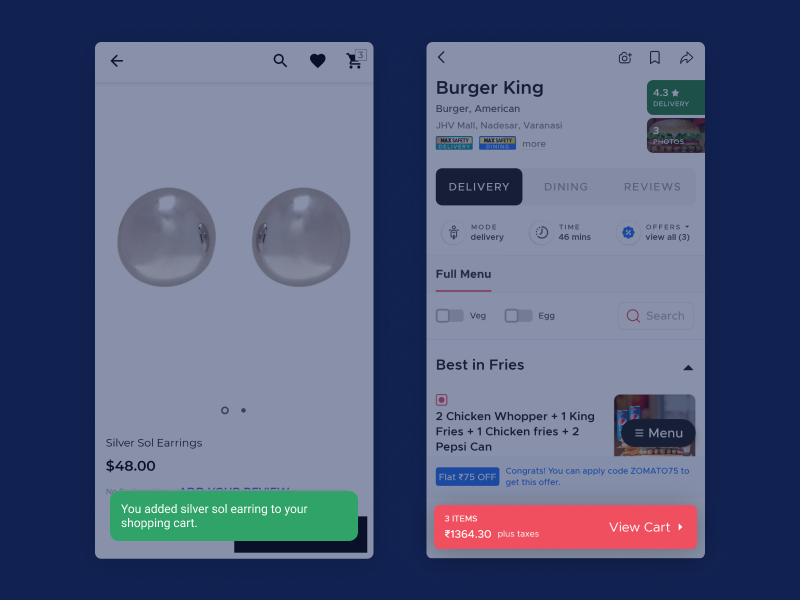
1.Cart Icons should be upfront and directly navigate to the shopping cart page.
2.Proper feedback to users about products added into the cart.

3.Ignore the additional popup or cart summary screen on mobile.
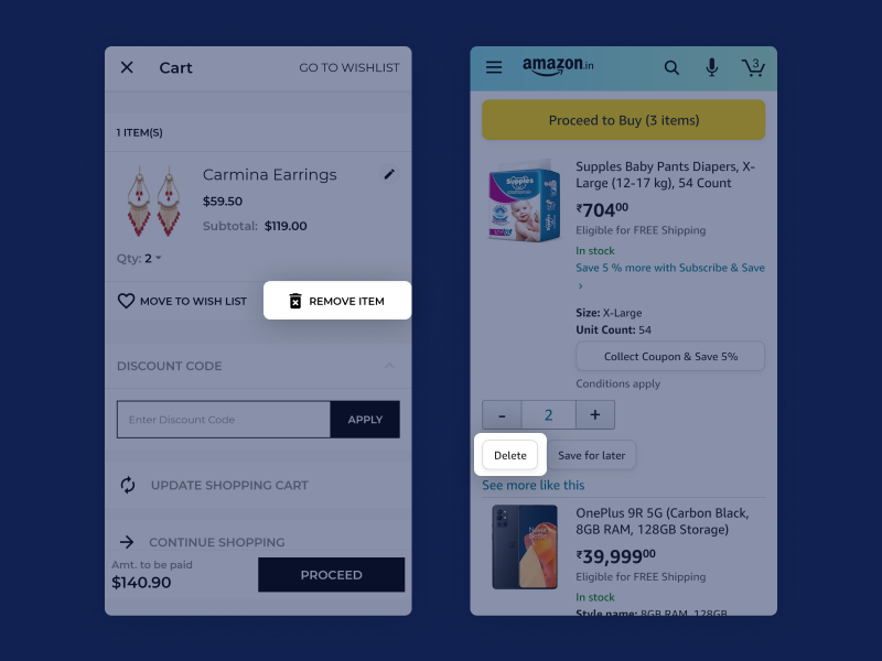
Remove or Delete Button
Cart page should have a clear ‘X’ or Remove or Delete button beside every product. So that users find it upfront and act. Nowadays, the Remove or Delete button comes under Quantity update with choosing ‘0’ zero from the dropdown or Clicking “-” minus multiple times to remove the product for a single action.
Update Quantity Button
” Update Quantity “ button in mobile as an additional action to update the quantity of the product. Don’t use this button on the site.
According to Jakob’s Law of UX, users prefer your site to work the same way as all the other sites they already know.
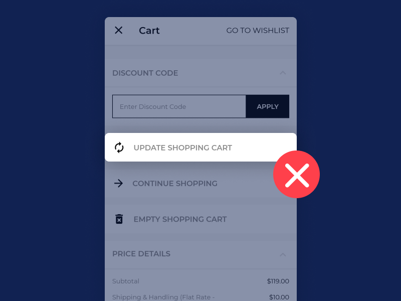
So many time, user move to the checkout page without acting and on the checkout page, he finds unexpected quantity which becomes the cause of abandonment.
Button Accessibility
The shopping cart UI is critical because every product in the shopping cart has the product name, image, configurable option, estimated delivery time information with some action button like quantity, remove the item, and save for later.
Keep standard “Tap Size” for these actions to perform their activities without any hindrance. The standard tap size is 48×48
Order Summary
The order summary should be upfront and clear amount for the product, discount, tax, and shipping charges.
Checkout page experience
Provide the easiest way to log in to the eCommerce Store. Don’t make unnecessary or mandatory fields like county, language, etc. If possible provide social login option for quick verification of user.

After login, As we know checkout process is quite lengthy. We can break the process into various steps. We break into the following steps
- 1.Shipping Address
- 2.Order Summary
- 3.Payment Option
or we can have 2 states by margining order summary and payment option
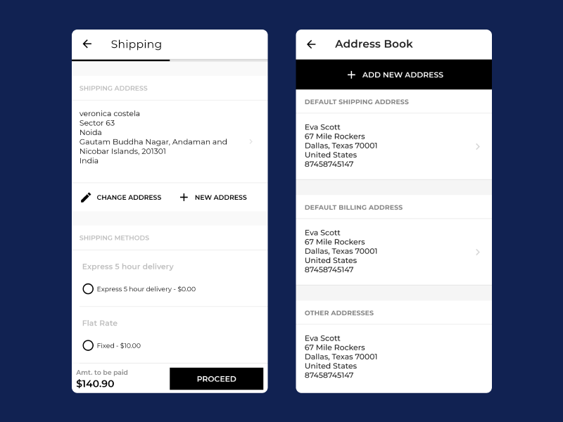
Shipping Address
Checkout should have the option to save the address in Address Book. So that, user need not fill address on the next checkout.
Provide the option to enter pin code or zip code text filed. By doing so, all the 3 fields that get auto-filled will save the time of the user or customer or we can use auto detect location to fetch location.
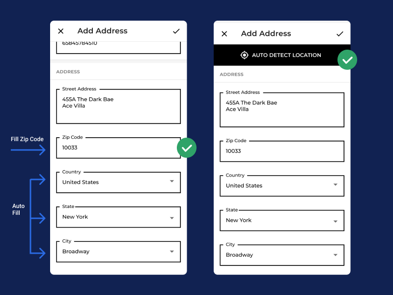
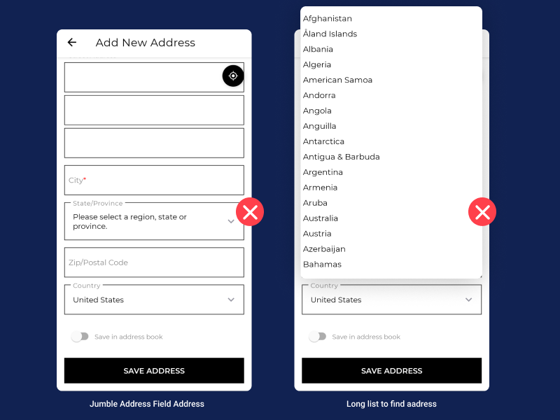
Ignore such type of user experience, options to choose Country > State > City. Really I don’t like if I have to fill a number of the field for a single product for a time.
The promising “Continue” button is fixed at the bottom of the mobile screen.
Order Summary
The order summary should have the product name, image, configurable option, quantity, estimated delivery time, subtotal, discount, total, shipping address, and billing address.
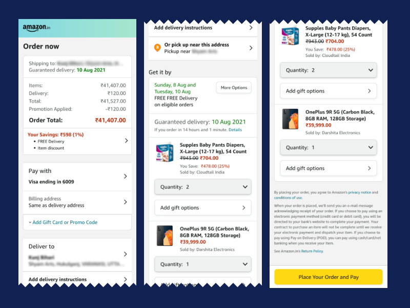
The promising “Pay Now” button is fixed at the bottom of the mobile screen and the stepper should have a back button option to update the address.
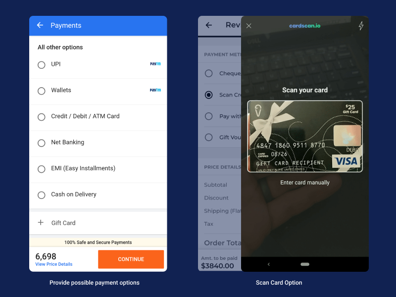
Payment Option
On this page just show the payable amount and available payment methods and It’s nice if we have a scan credit card or debit card option to auto-fill the information of the cart
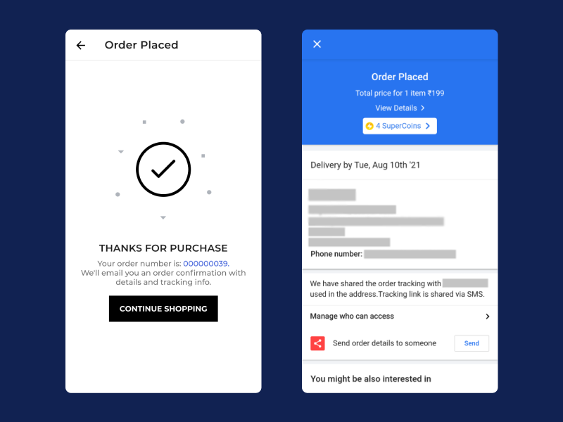
Order Confirmation Notification
It’s most important to give proper notification to the customer that the order has been placed successfully with all requirements and must have a link to view the order.
For this blog, Thanks to the following apps that I list as follow
- 1.Mobikul Mobile App For Magento 2
- 2.Amazon Shopping, UPI, Money Transfer, Bill Payment
- 3.Flipkart Online Shopping App
- 4.Samsung Shop
- 5.OnePlus Store
- 6.Big Basket
- 7.Zomato
A good user experience is not for mobile-only, also needed for the websites. We have One Step Checkout for Magento 2 for the eCommerce store for quick and easy checkout on the web.
Thanks! like to see you here.
